Where today every organization is looking forward to embracing advanced analytics to make sense of their growing volume of data, Business Intelligence (BI) opens up a world of opportunities. BI can add value to almost every business process. Information from improved productivity to deeper insights into what customers want and how products are being used, BI helps with almost everything. Business Intelligence can enable organizations to deliver newer insights, direction, and help become substantially more proactive in their approach to analyze their data to find efficiencies and make better business decisions.
For better business value and to follow track consistently, your BI professional needs to have qualifications in vast areas and be up to date with all new trends. With the advancement of technology, digital transformation is now seen as a crucial strategic initiative and business intelligence tools have evolved like a boon to help companies make the most out of their data. The response is the result of the increasing capability of modern days business intelligence platforms in action that support data access, interactivity, discovery, real-time alerts, actionable dashboards, mobile data access, AI-generated insights, AI-powered Data Podcast and lot many things. While the overall Business Intelligence market is expected to grow at a CAGR of 9.5% from USD 17.09 Billion in 2016 to USD 26.88 Billion by 2021.
Here are the top 10 real-world examples of Business Intelligence tools in action.
- Bringing a holistic view (Collecting and stitching right data)
- Alerts from your Business Intelligence System (For real-time action)
- Have more actionable dashboards (Insights to action)
- Experience matters (Presentation with the motive of action is widely prevailing)
- Optimize your mobile data access (Anytime and any device accessible)
- AI-generated Insights (Intelligent insights for smarter people)
- AI-powered Data Podcast (Experiment your ways of delivering information)
- Lift analysis (Hitting the bullseye with your campaigns)
- Dashboard solutions for Marketers (Enhancing CMOs effectiveness)
- A/B Statistical Significance Calculator (Relationship calculator for your data sets)
1. Bringing a holistic view (Collecting and stitching right data):
BI reporting platforms enable you to make an informed decision but the challenge persists with how to handle growing volumes of data from multiple sources. You will also face challenges with data synchronization and stitching it at the right granularity level. To have accurate insight into how your company is doing at any given time you need a business intelligence tool that translates high volume data from across departments into a holistic view of the organization.
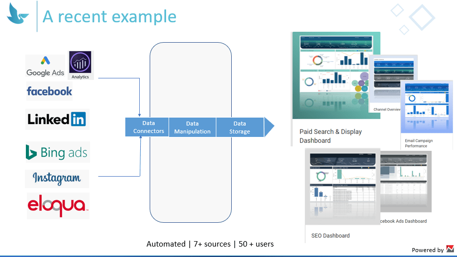
Solution: Although the client was in data practice still their data were scattered at different places creating confusion about last–touch attribution. We took an approach of first understanding the business goal and their existing data sources. This helped us to decide on which all data sources should be automated and what all data should be stitched together.
Our aggregated analysis of the situation empowered our Client to automate 7+ essential data sources and 50+ users. Being able to see one version of the truth also empowered them to take a real-time informed decision.
2. Alerts from your Business Intelligence System (For real-time action)
It is very easy to lose track of what matters to you when you monitor plenty of KPIs and manage a lot of dashboards. Business alerts will help you out with situations like when predefined goals met, or whenever an unexpected event happens, you will be notified and keep full control of what drives your business.
Solution: Setting up customized data alerts is the most effective way of monitoring your business performance. Setting up alerts is not that complex, but your BI team or consultants should first pick the right KPIs for the right set of people. So, the discovery phase of the BI becomes important, in which you understand the pain points. Sometimes not a lot of clarity, but that would be enough of direction to think of KPIs and alerts. At times, a high–level KPI won’t be much of interest need is to look for something relatable or try to derive a score or ratio. The final step is to set up thresholds and mode of alert. Mostly emails are preferred to receive alerts, but some cases SMS text.
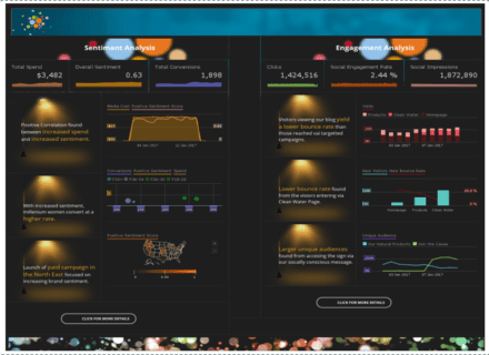
3. Have more actionable dashboards (Insights to action)
Deciding on what should be on the dashboard is very important. You don’t need massive amounts of data on a dashboard, just the data that is enough to help achieve your organization’s Key Performance Indicators (KPIs) is sufficient. The winning score is not the total number of dashboards, but how many dashboards are actionable and used widely. Few elements to make the dashboard more actionable are: Content Benchmarks, Goals, Real–time KPI Monitoring, Traffic Trends, Performance by Topic and Persona, Engagement Metrics, Proof of ROI.
Solution: We empowered our client to look through their sales performance dashboard. There were a few dashboards talking about sales performance. Each sales manager had his or her threshold on activities (follow up calls and emails/inquiry) depending on services. They used to look at those dashboards and conduct review meetings. But a lot of tables and discrete visuals made it tough to understand the overall performance and to see, where they stand compared to other sales folks.
A distribution was created for them using a scatter plot and made it dynamic by enabling reference lines and then interact with the viz, giving them actual results in the datasheet.
4. Experience matters
Maybe you might have accurate data ready with all the complex transformation. But the way it is presented matters. The cultural shift of looking at data with a motive of action is widely prevailing. So, while enhancing those capabilities, we may need to look at the look and feel of the visuals. The correct type of charts, correct usage of metrics and dimension along with a good presentation layer makes a lot of difference.
Solution: A switch from input to output. With the increasing focus of input of quality and right data, there is an increased demand for quality output. The understanding of what visualization can offer has largely driven the demand from the consumer’s side.
An interactive and self-explained Business Intelligence Dashboard can be a great way to compile several different data visualizations to provide an at-a-glance overview of business performance.
5. Optimize your mobile data access
The benefits are numerous in mobile business intelligence. Anytime and anywhere availability of data is the need of the time. This helps you create a culture of data-driven decision making by spreading business intelligence more widely throughout your organization. But the journey doesn’t just happen. There are differences between the visuals in the desk and the data on the go. Should you recreate your entire business intelligence infrastructure? That could take years.
Solution: If you are considering mobile BI or already going mobile with BI, here are five best practices for distributing information with a mobile audience in mind.
- Avoid dashboard proliferation
- Write to a smaller form factor
- Consider an audience on the go
- Account for new mobile scenarios
- Leverage mobile’s natural process of collaboration
But before you consider going for Mobile BI here are few things you should know:
- A smaller screen means you have less real estate to work with. The layout must be streamlined, neat, and minimal.
- Display only the barebones of the desktop version essential data the user cannot do without. Ideally, create an exclusive mobile business intelligence dashboard to represent this.
- Since users will be checking data on their phones on the go, they are more likely focused on daily operational data rather than analysis.
- Account for touchscreen – “Fat fingers” It’s frustrating tapping on an element on the screen and being taken to the wrong page. Make sure there is enough room for each widget and those visual elements are sufficiently spaced out.
- Be consistent in terms of layout, colors, and elements across the app to avoid confusing the user.
- Contrasting colors. Since mobile dashboards are designed for a small screen, you want to ensure that it is visually appealing and draw attention to key elements. Contrast your background and foreground colors so that the data points stand out.
6. AI-generated Insights
Enterprises seem to be entering into a new era which will be ruled by data. AI in business intelligence is evolving into everyday business activity. You can now use machine learning algorithms to identify trends and insights in vast amounts of data and make faster decisions that potentially position you to be competitive in real-time. Prominent solution providers have gone beyond creating a traditional solution to developing complete holistic platforms that better automate business intelligence and analytics processes.
Solution: AI can be used to unlock the power of true analytics. While the traditional way of building up on hypothesis is through querying data, AI will help decision makers to use query data to validate a machine-generated insight.
Companies like ING, Walmart, and GE have been using AI derived insights for years now. Here’s more on it.
7. AI-powered Data Podcast
Setting up a data podcast for your enterprise is another innovative way to deliver information. The AI layer will get you the insights in plain text and the NLP layer would convert it an audio layer. You can even try something fun with background and branding for your enterprise.
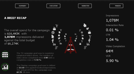
8. Lift analysis
Lift analysis is a way to measure how a campaign impacts a key metric. When it is about multi-touch attribution, a marketing lift analysis can be applied by looking at occasions that were influenced by your campaign and comparing that with occasions that were not influenced by your campaign. By comparing your treatment group against your control group, you can see the “lift” in each of the metrics mentioned above and make data-driven decisions about which campaigns to invest in or which campaigns to stop investing in.
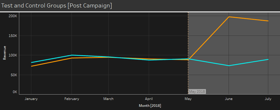
They help you get a better picture of the overall performance of your model. You can quickly spot flaws if the slope of the lift chart is not monotonic. Additionally, it helps you to set a threshold, which users are worth targeting. Finally, you have an estimate of how much better you can target users compared to random targeting.
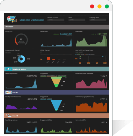
9. Dashboard solutions for Marketers
Successful marketing blends hard data and creative insights. You can view all your data sources in a single marketing dashboard, including your social media platforms, CRM, Google Analytics, Content Marketing Dashboard, Web Analytics Dashboard, etc. With all your marketing KPIs in one easy-to-read dashboard, you’ll immediately see opportunities to optimize your overall strategy.
Solution: Like a modern-day CMO you are using all types of marketing technologies and tools. You have numerous data sources and always creating a holistic view in one dashboard is challenging. CMOs usually looks for the following types of dashboards:
Marketing funnel Dashboard, Pipeline Dashboard, Social Media dashboard, Content Marketing Dashboard, Web Analytics Dashboard, Search Engine Marketing Dashboard, Search Engine Optimization Dashboard.
Here we helped our client by first taking an approach to understanding the business goal and types of data. This helped us to decide on which all data sources should be automated and connected and make data flow to one single dashboard to give a holistic view of complete marketing performance. We also empowered our client to stitched together relevant data at the right granularity level.
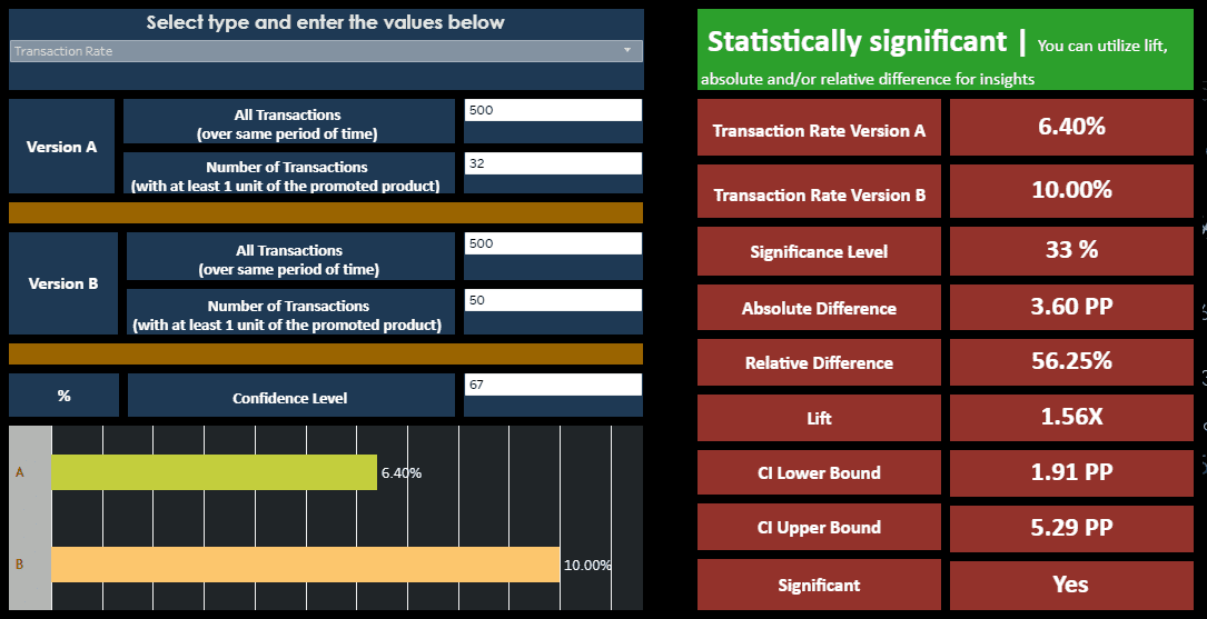
10. A/B Statistical Significance Calculator
An A/B testing significance calculator is a statistical hypothesis testing tool and is made to calculate the relationship between two data sets and those data sets are then compared against each other to determine if there is a statistically significant relationship or not. Our clients use the A/B Significance calculator to determine whether the A/B test is statistically significant or not. You can also check it out HERE
Conclusion
If you want to stay relevant to the digital disruption you must move forward with a serious strategy about your data. While much of the data analysis going on today is based on historical data, the focus is rapidly shifting to AI in business. Today it is no more about just presenting data. The emphasis is to give more towards actionable insights. To stay relevant to competition in 2020, you must be aware of the latest BI tools in action that can empower you to take relevant business decisions in real-time.