Tableau is one of the powerful and fastest growing data visualization tools used in the BI industry. With the advance intelligence features, it creates data than can be easily interpretated by professionals at any level of an organization. Tableau assists businesses make the right decisions by using data visualization features, which are available to business users of any background and industry. It also gives marketers the opportunity to create a Tableau KPI Dashboard based on their business requirements.
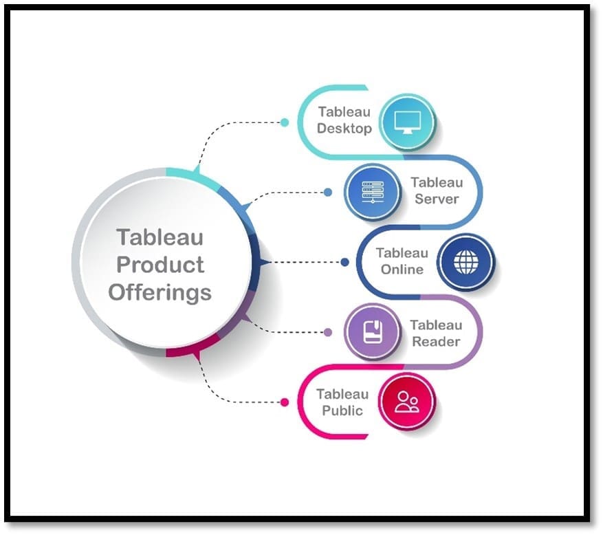
Tableau connects to any data sources including Excel, Data Warehouses, and others. With an easy-to-use, drag-and-drop interface, users can come up with insights in just a few moments. Tableau quickly analyzes data to generate visualizations as dashboards and worksheets. With Tableau, users can create custom dashboards that provide actionable insights and decisions that drives business forward. Tableau can also be used to explore data with limitless visualizations.
Key Tableau Features:
- Advanced dashboards
- Collaborative sharing
- Data connectors
- Advanced visualizations
- Predictive analytics
- Robust security
- Live data connections
Tableau KPI Dashboard & Its Importance:
Key Performance Indicators (KPIs) are the bricks of any data visualization tool or dashboard — in any Business Domain. A smart way to create them is to develop a KPI template, which is a set of expressions and parameters that blend data that explains your business. KPIs offers a glance at various performance metrics such as marketing, revenues, sales, trends etc., and help businesses make data-driven decisions. KPIs track performance and assess how well the business is performing against objectives. With the help of KPI dashboards, relevant metrics can be brought together, to be measured, analyzed, and observed in a single platform. KPI dashboards are best considered from an operational and strategic perspective.
A quality KPI dashboard gives management quick access to the critical indicators or instruments of the business and helps them decide whether they are on right path or not. With this the business can work on improving those metrics. Tableau KPI Dashboard can be used to visualize various metrics in the form of charts and graphs which will get the users attention. KPIs are usually color-coded with arrows indicating upward or downward trends. Tableau is equipped with excellent interactive services to create appealing and attractive visuals, which plays a vital role in effective communication. Tracking the right KPIs will allow the company a good insight into what is working and what is not. This helps to save time and money in the long run.
Let’s understand with help of top KPIs and metrics which can be measured in different dashboards.
Finance Dashboard KPIs:
- Gross Profit Margin
- Operating Profit Margin
- Operating Expense Ratio
- Net Profit Margin
- Working Capital
- Turnover
- Active Customrs
- Sales Margin
- Cash Conversion Cycle
- Accounts Payable Turnover Ratio
- Accounts Receivable Turnover Ratio
Sales Dashboard KPIs:
- Growth Rate
- Customer Acquisition Cost
- Customer Lifetime Value
- Customer Churn Rate
- Lead Conversion Ratio
- Sales Opportunity Score
- Average Purchase Value
- Revenue per Sales Rep
- Profit Margin per Sales Rep
- Incremental Sales
Marketing Dashboard KPIs:
- CPA (Cost per Acquisition)
- Average Order Value
- CPL (Cost Per Lead)
- ROI (Return of Investment)
- Web Traffic to Lead Rato
- Lead to MQL Ratio
- MQL to SQL Ratio
- Customer Lifetime Value
- Goal Conversion Rate
- CPC (Cost per Click)
- CTR (Click Through Rate)
- Bounce Rate
- Conversion Rate
- CPM (Cost per Thousand Impression)
- Impressions
Design Better Dashboards Layouts with Tableau
Why Choose Decision Foundry as Your Tableau Consultants
Decision Foundry is a leading global analytics agency, helping customers succeed using data. Decision Foundry has always been vocal about “Designing with Data,” following all possible ways to enhance data user experience. With our proprietary DETA framework, we have successfully unified and automated data with top-quality storytelling. Talk to us if you are looking to enhance your data user experience. We aren’t just your extended BI team but a strategic partner that will efficiently scale your Business Intelligence.
Benefits of Working with Decision Foundry
- Collaboratively work with Tableau experts and Certified Professionals
- Proprietary DETA framework with 100+ implementations, and counting
- Unmatched data user experience that yields deep insights
- Augmented dashboards through advanced, AI-enhanced analytics for deeper understandings
Partner with one of Tableau’s leaders in dashboard management for expert Tableau Consulting. We document, build, and automate a new reporting solution for you, or extend the value of your existing reporting infrastructure. Reach out for a quick start.